Designing the Cover for Stealing Luna
When I set out to design the cover of my book, Stealing Luna, I was terribly excited by the prospect. The book has a lot of visual cues to take from —it’s set in Barcelona! There’s a painting! It’s a romance! all of which I can kind of pull from. I was also redesigning the cover for The Queen’s Game, so they needed to match.
Crack open any book by a famous lettering artist (I highly recommend Jessica Hische’s In Progess) and they’ll talk you through their process for designing any piece of major lettering work. I’m a lazy person by nature, so I might have skipped a few things and went straight to my design program, but it still helped.
The first step is to list down a word cloud relevant to the work you’re doing. For Stealing Luna, it was the following:
Barcelona
Juan Luna
Romance
Burnt Sienna (it’s the color of Barcelona in my mind)
Then I considered to my usual personal style, and the current style of the Queen’s Game which was:
Personal photos in the background
#romanceclass covers photo
Specialized lettering title
Bold color!
The Queen’s Game had roses on the cover (which I know, weird, should have been sunflowers, but roses and red felt more royal to me)
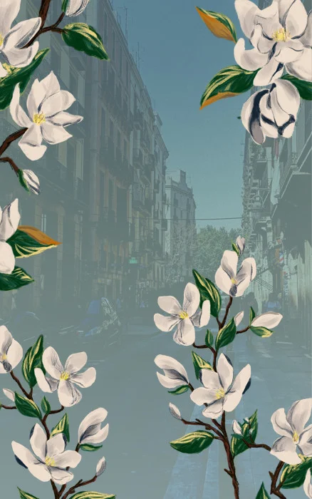
So I had a very vague idea of what I wanted to do from there. I had an illustration of gardenia flowers in my Procreate app that had no particular purpose, so I thought it would be nice to incorporate that to the cover, so it could be somewhat similar to The Queen’s Game cover.
The second step in the process is to sketch things out before you lay them out on your digital app, but I decided to skip all of that and did all of my testing on Photoshop instead. Ah the fun of working for yourself, haha.
The Background
Here’s the little inspiration mood board I had for the cover, which I turned into a postcard for those buying future print copies of Stealing Luna.
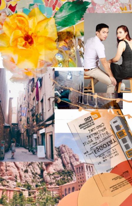
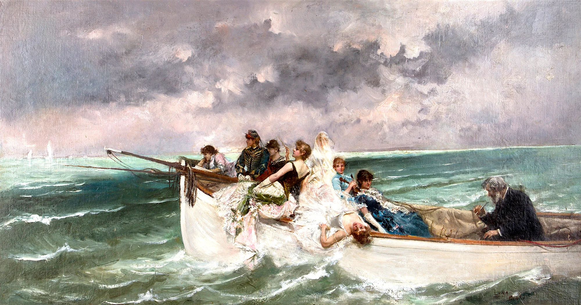
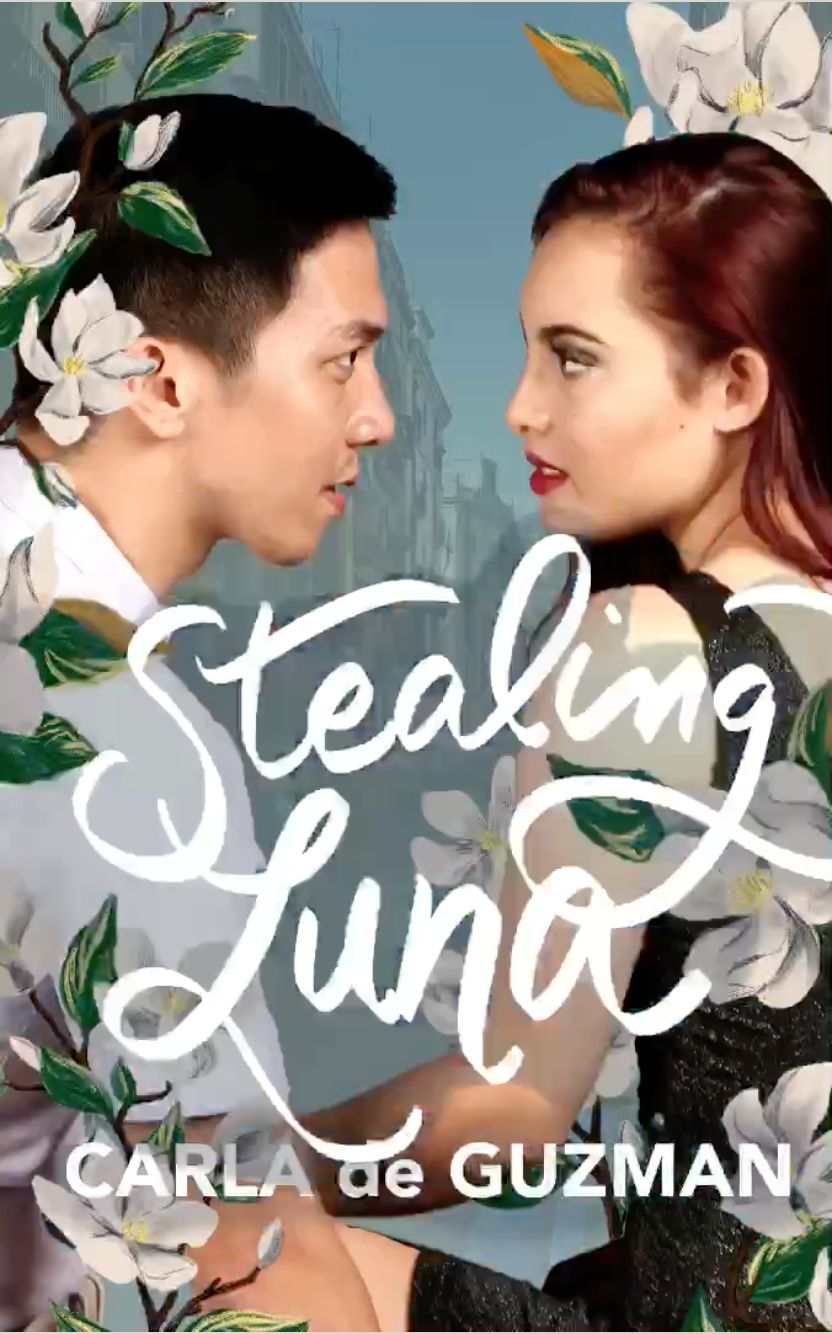
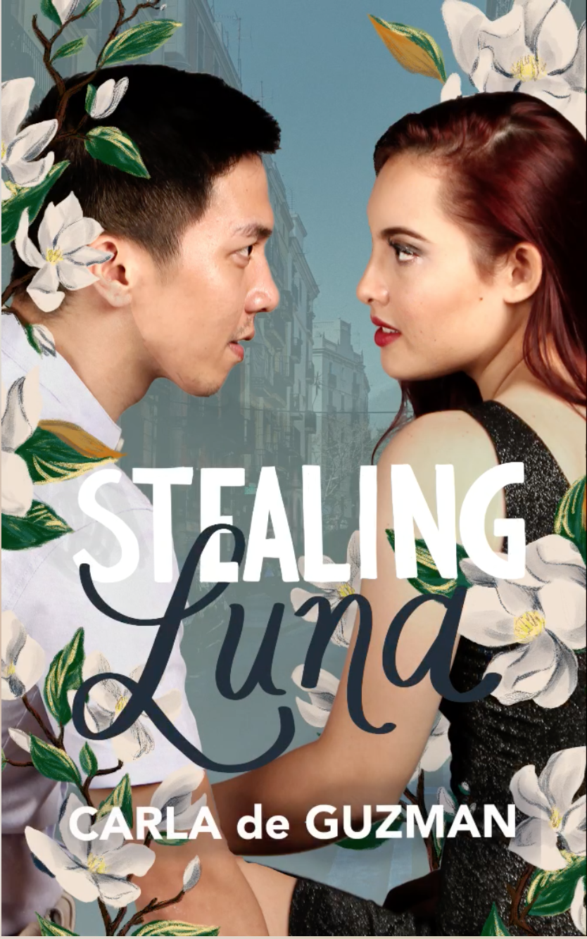
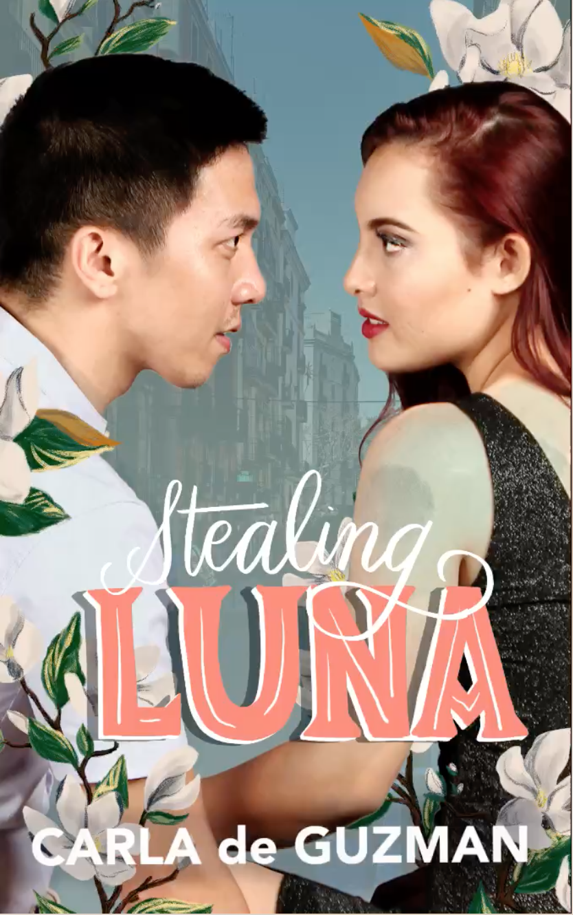
Taking that, and color inspiration from the Juan Luna painting that the characters were going to steal, I chose the blues from the seas of A Do Va La Nave for the background, and the pink/orange tones from my Barcelona photos for the title. The background photos of the street and Park Guell that you see in the cover are from my personal travel photos, which I always enjoy taking and using on my covers.
Then it was just a matter of editing the photo I purchased from the #romanceclass covers catalog. Gio’s shirt was too light so I needed to recolor it to match the background a bit, and I closed the distance between him and Rachel. Then there was making sure their hair still looked like hair (so hard to crop, honestly), that everything looked properly spaced and the shading didn’t look weird.
I decided to go with using a real person photograph instead of going full on illustration for this cover because at it’s core, Stealing Luna is a romance book, and I wanted to highlight that by the way Gio and Rachel were looking at each other. So intense, and sexy as well!
The Title
When I was doing my research for Stealing Luna, I looked up a lot of Juan Luna’s paintings and found myself staring at the signature. Luna used to sign his name on his paintings a very particular way—he would sign with Baybayin symbols “bu la”, which translates to ‘moon’ in his native Ilokano, and of course, his last name. Then he would write the ‘u’ in his name with a ‘V’, which I found particularly interesting.
Matching that with Art Deco-esque designs I saw while looking though Louise Fili’s Grafica del Calle (a book full of shop signs from Spain), I came up with a few sketches for the lettering.
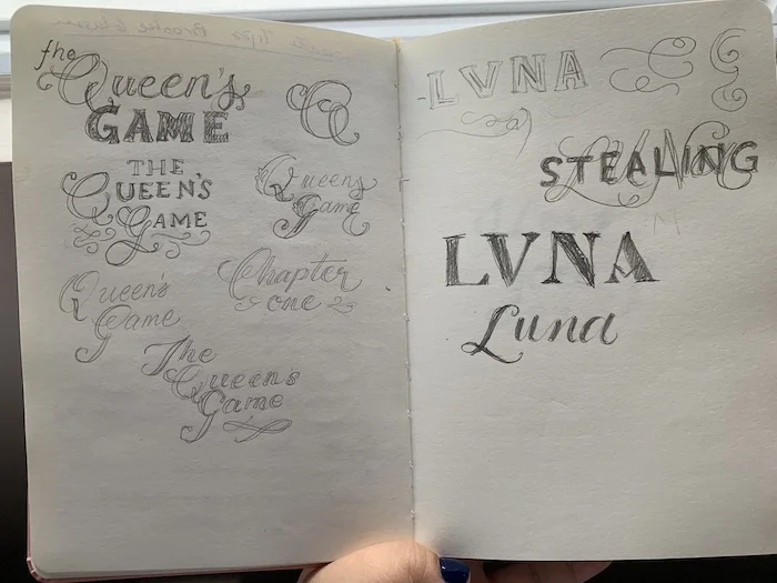
The original plan was to make the letters white, to match The Queen’s Game, but I wasn’t too big of a a fan when I started doing the cover on my iPad. I had a little timelapse video of me doing the lettering, you can see me going through the stages of considering each of the designs I sketched on the laid out cover. Let me tell you, it was a STRUGGLE.
I ended up ditching the LVNA idea for the sake of readability, but maintained the impression of how he did his signature—in all caps serif.
And, I think that’s it? Among all the covers I’ve done, Stealing Luna is one of my favorites, and the response has been phenomenal! Let me know if you have questions about my design process (wow), or if you need a cover designed, I’m game for that too.
Just…I really like using real people on my covers, and I’m working to make sure that my one last illustrated cover straggler (ahem, If the Dress Fits) gets with the program. I’m really excited to get started on that cover as well!