Painting With a Color Chart
Let's call this a little experiment in watercolor.
I got a set of Winsor and Newton Cotman watercolors at Alessa's Botanical Watercolor classes last year, and after the workshop, decided not to touch them. I experienced disaster with the Van Gogh set I got before, and realized that I don't know enough about watercolor to use it as a medium. So I experimented with gouache, which worked out pretty well for me.
But as I continued painting, I kept coming back to watercolor, testing it out, sketching with it until I felt comfortable. I observed my sister Frances' process in painting and picked up a couple of things, looked over the 'zines from Alessa's class (so useful!) and tried to refine my technique a little more.
Then I watched this Skillshare class by Elisa Choi Ang and she showed me how to make a color chart, and to utilize it to paint. So last night I did it. I finally got the courage to break out the Winsor Cotman (with 12 colors, it was the easiest to chart) and tried it. This post is just a way to document my process/progress and hopefully help someone else too.
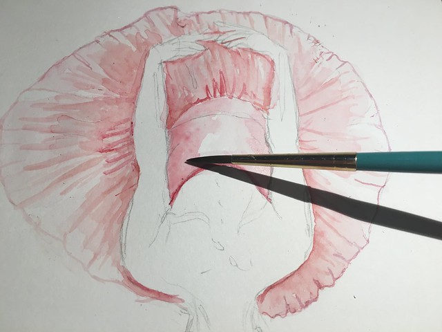
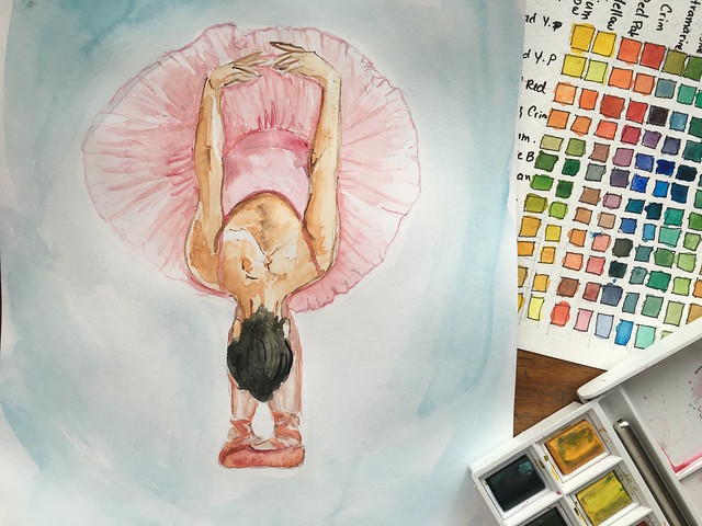
I started with a sketch of my ballerina. That's my color chart next to the sketch! I fail at making grids and straight lines, but it works. Anyway. If you look at the sketch, I've sort of marked out where I want the highlights to be. The sketch is also very loose and light, since it's more of a guide than anything else.
The best thing about the color chart is that it gives me all the colors I need in the most surprising way. I used crimson + china white to make the pale pink wash to highlight the tulle of the skirt, (since watercolor is done lightest to darkest) then aliz crimson + burnt sienna for the midtones and shadows, waiting for each layer to dry and adding water when the colors aren't blending the way I wanted. When painting the midtones, I made sure to leave blank the areas I marked for the highlights, ending the paint just before the pencil marks so I could erase them.
I used the Canson Lettering Progress Keeper paper for this, and even at 210 gsm, the paper still had a hard time absorbing the paint and water. Might stick to 300gsm next time. After I was happy with the inside of the tulle, I lined the outside with a bit of watered down crimson and a 0/20 brush.
I always use a reference when I paint (this in particular is Misty Copeland emulating Degas' paintings, which was instant love), and it really helps me nail down where the shadows and the highlights go. Choosing the right color for the skin was the trickiest part. Misty's skin is actually darker than than this, but I'm pretty happy with the Yellow Ochre + Burnt Sienna mix, using a Burnt Umber for the deepest shadows and the light sketch of the fingers.
One of the reasons why I hesitated in using the Winsor and Newton set was because it didn't have some of the colors I always used (purple, black, sky blue) in my usual Sakura Koi sets. But because of the color chart, I realized how wrong I was. Who knew that Intense Blue + Burnt Umber made a beautiful black?
Then for the shoes I used a Yellow Ochre + Cadmium Red Pale. I wanted it to look a different kind of pink against the dress. The legs were doubly difficult to choose a color for since you want them to look like legs, but make it obvious that she's wearing tights underneath. So I chose the Yellow Ochre (same base as the skin) + Aliz Crimson. All of this I knew would work well because of the color chart!
Here's the final product! I'm a little bit more confident in trying out the Winsor Newton set again. Yay to adventures in watercolor. Hahaha!


